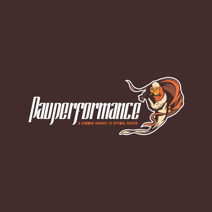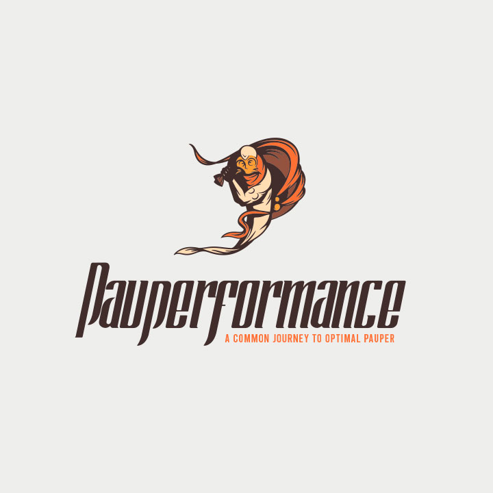
Pauperformance is an online project designed for a niche of players of Magic: The Gathering, the first and most popular trading card game in the world.
The project consists of distinct yet linked parts, spanning multiple websites and community platforms, uniquely characterized by a common set of stylistic traits.
The customer's desire was a logo that joins the letter "P" with the sketch of Gray Merchant of Asphodel, a character from the game.
Starting with a stylization of the original illustration and taking advantage of the sack that the merchant carries with him, I managed to simulate the letter without losing the reference's recognition.
Just like Mildly Poisonous, in this case, the logo is different from the previous ones, thanks to a less geometric and more illustrative style.
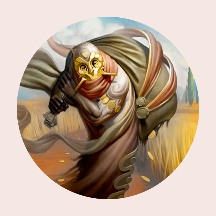
Gray Merchant of Asphodel | original artwork

Logo anatomy & colors
